Top Ten Tuesday is a weekly meme created by The Broke and the Bookish.
This week's post is:
Top Ten Covers I'd Frame As Pieces of Art
Top Ten Covers I'd Frame As Pieces of Art
Top Ten: ( in no particular order)


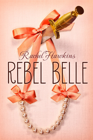
Rebel Belle:The simplicity and beauty of the necklace adds to the contrast between it and the knife on the cover. I love it because with a quick glance it looks like a contemporary novel but once you look closer you see that there is much more to it.


The Forsaken: I love the complexity of this cover. The author could have easily just put a simple face on the cover but instead took a different route and I really like it.


The Winner's Curse: I really like that the title is vertical instead of horizontally towards the top. For me it immediately catches my eye as well as the colors, font type, and of course the girl's dress.
*****
What are your favorite covers? Comment and let me know!!


The Forsaken: I love the complexity of this cover. The author could have easily just put a simple face on the cover but instead took a different route and I really like it.


The Winner's Curse: I really like that the title is vertical instead of horizontally towards the top. For me it immediately catches my eye as well as the colors, font type, and of course the girl's dress.
*****
What are your favorite covers? Comment and let me know!!
No comments:
Post a Comment
Hey guys! I love reading comments so don't be shy and leave a comment if you would like. Thanks for stopping by and Happy Reading!