Top Ten Tuesday is a weekly meme created by The Broke and the Bookish.
This week's post is:
Top Ten Book Cover Trends (or elements) I Like/Dislike
Top Ten Book Cover Trends (or elements) I Like/Dislike
Top Ten: ( in no particular order)
Dislikes:
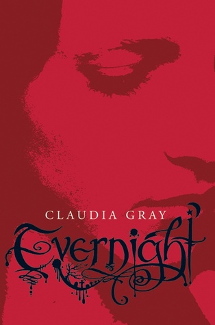
I'm sure you can see a trend here...CLOSE UP Faces! I really don't like these types of covers. For me they're just a little creepy and unattractive to see someone's face zoomed in on the front cover. Nothing personal to the models that pose for these covers! And with The Perks of Being a Wallflower cover, I just think it is boring and bland.


Likes:
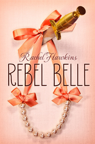
If you can't tell, I'm a typography girl! Those types of covers really catch my attention in a good way mostly! Also with the close up eye and girls face on Unravel Me and Incarnate, I feel that it works for those covers and I don't mind it since it's done in a tasteful way.


*****
What are your favorite/least favorite book cover trends?
Comment and let me know!!
I love all the Shatter Me book covers with the eyes. I think that it is a neat idea and they look really nice next to each other. I also really hate all the Vampire Academy book covers. I am seeing those on a lot of bloggers lists.
ReplyDeleteYes I agree! I love when book covers are different like the Shatter Me books. It's very eye-catching and also uniform when they are on your shelves together.
Delete